Orientation
This time I was thinking of adding some more about composition. And in this case not even about what is on your photo, but about the orientation of the photo.
 For those that want to go quickly through this, I found an awesome explanation on XKCD, which tells the whole story of it. That story includes the new, bold and dynamic method of diagonal! On a more serious note, there is a difference on the orientation. Sometimes one is more suitable than the other. Even this graphic shows already a bit of that. Horizontal has people and tree, vertical only 1 person and diagonal has half a person and a mountain. In general it can be said that tall subjects are more suited for a vertical orientation and wide subjects for a horizontal orientation. But it is not always that simple. So I grabbed a few example shots I made and try to give some noob-ish explanation. Which you probably had expected, but if you would have wanted a pro explanation, you would not be reading this blog, would you?
Fairly obvious
My first example is in my opinion an obvious choice.
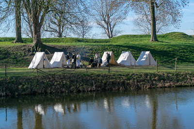 A photo made at a re-enactment at Slot Loevestein in the Netherlands. Some tents, soldiers, water, grass, trees and sky. The tents make a nice horizontal line, they have a nice reflection, which also is horizontal. In fact, I would say all lines in this photo are horizontal. You could exclude the trees, but it's not the trees that are the subject. The line of trees add to the scene as environment.
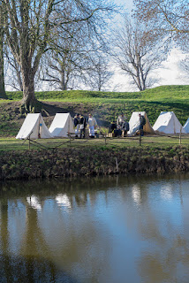 Here we have almost that exact line of tents, soldiers and trees. Due to the width, the tent on the right mostly fell off, you just see a small part of it. If I would have wanted to bring over the idea there would be many more tents there, this might have been a possibility.. The water, instead of a horizontal feature, now feels more like a square area and is hogging the lower part of the photo. Unfortunately with little detail, except for a shadow of something unrecognizable on the lower left. There is also more air. Which is not too bad as a background, but not a very interesting air to have much of. The leafless trees of which we can now see more and higher branches also do not add much to the photo.
The subject of the photo here was the horizontal line of tents and soldiers, plus the also horizontal reflection of it in the water. The air and water at the top and bottom add nothing to this photo. So I think this indeed is a fairly obvious example of that generic rule: horizontal subjects are best displayed in a horizontal orientation.
Of course, a photographer does not call this horizontal or vertical, he calls it landscape or portrait mode. For the diagonal orientation is no photography term yet, so, giving it is bold and dynamic I opt to call that boldamic mode. Keep in mind where you heard that phrase first, I want due credit for it!
Less obvious
My second example is already less obvious, because it might depend on what I would want to bring over. Both photos have a couple sitting in front of a castle.
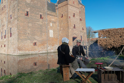 At that same re-enactment as the previous photos, I saw these two people sitting and talking. They looked nice enough to make a photo of them, with enough of the castle in the background to give a clue about the surroundings. I would call this a decent photo and am happy with it. To me the composition is nice enough and it brings over what I wanted to show people.
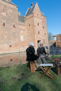 What the previous photo had less, was showing the height of the castle. Okay, not really fair, you can see the roof starting, so you get an obvious hint. But the left side could be awesomely high. So I added the photo in portrait mode. For showing the height of that left part, portrait mode is more suitable. There are some annoying things on this photo, which makes it not my choice. Mostly: to not have the people tucked away in the lower corner, I had mroe grass on the foreground. It unfortunately adds nothing, but - like the previous one with the water - an undistinguished shadow. The castle seems to lean more backwards here, and I miss out on that table in front of them, which I think makes a decent foreground, contrary to the grass.
So, I would again pick the landscape photo, because I think it is way more pleasing and better balanced. Plus it shows the people in front of the castle, with just enough information about the size of the castle. The portrait photo gives more information about the height of the castle, but less about the width, as you now do not see the corner. Therefore I would say it's still fairly obvious which is the better photo, but it does demonstrate that the orientation might convey different things.
I changed my mind
The next example had me change my mind about the orientation I would choose. Again two photos taken at that same re-enactment.
At one side was a low hill, from where you had this view of the castle. It offered a nice possibility of showing the castle, including a few of the buildings next to it. I would not call this the greatest shot ever. The leafless trees do frame the castle, but somehow leafless trees rarely make lovely frames. There are also a leafless trees in front of the castle. Nonetheless, there is most likely not much better to get from this angle and it does give a bit of an overview.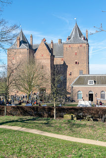 When I arrived at that low hill, I actually wanted to have a photo of the castle and not much of the other buildings. I also wanted to show the castle has a bit of height. So, portrait mode was obviously needed. I did notice the branches on the right poking into the photo, but could not easily find an angle without them, so decided I would later remove them in post processing. This photo obviously emphasize the height much more than the portrait photo does. So you could call this: mission accomplished. Of course, as I looked at both photos later, I felt the landscape mode did bring over way more than the portrait one. Which made me happy that I had taken a shot in both portrait and landscape mode.
Which is better?
If you got this far, you probably already know I am going to answer this with: neither. It all depends on what you want to bring over. But from my last example, you might get the idea that I do advise making a shot in both orientations. Even if you think you need only portrait, as I did with my last example, it can be worth making the other one. It can surprise you later.
I often take both, if I have the time for it. As I am usually just snapshotting, I do sometimes get photos where my original idea of portrait or landscape simply does not work out as good as I thought. And hey, it's a digital camera, the extra shot is only a click away and costs nothing if you decide not to keep it.
 Now just one final remark about this part of composition. In all my
examples I preferred the landscape orientation, so you might think I do
never pick portrait. The photo I actually published from the first
examples was a portrait one. Is it better? I do not know, but it is the one I finally picked. Although it is obvious that I changed my viewpoint a little, because it was not possible to make that photo from the position the other two were taken from. And that shows the number one of Rick's rules on my previous blog entry about composition: value viewpoint.
Besides the last one, none of the photos was edited, besides a bit of exposure compensation. White balance is not set, nor any other edits.
