14 July 2021

 MOVED

I have moved my blog to WordPress. It can be found here.

30 September 2020

Work on a turtle

 We're getting close to the last quarter of 2020 end I have not made a single post. Then, due to Covid-19 this has been a strange year. Not going out as much, also means less photos. That does not mean I have done nothing, I have spent some nice time doing my favorite thing: processing photos. I have set my first steps in compositing beyond replacing the sky.

But that is not the topic in this post. In this post I want to talk about a turtle. Or better the photo of a turtle. Some professionals make these nice video's about their workflow, sometimes free, sometimes paid. For free you could watch Unmesh Dinda on PiXimperfect. I think he is a very good teacher. I had books and seen video's from Scott Kelby, also an awesome teacher. Or Matt Kloskowsky, yet another fine teacher. I am no where close to these guys, so will refrain from making video's. But I can share a bit of how I precessed the turtle here:


The original

My original photo was shot at Almere Jungle, where there was a pool with turtles. This particular one was sitting a bit at the front, nicely on his rock. So out comes the camera (okay, I had that already out) and one click later we have the following photo:

For the ones wanting all the details, the following can be said:

Camera: Nikon Z6
Lens: Nikon 28-300mm 
Aperture: f/8
Shutter speed: 1/30
Focal length: 112 mm
ISO: 800

It is a kind of photo I regularly shoot, rfairly zoomed in on the subject, without much surroundings. Even then, the surroundings are - to me - still distracting here. Specifically that bright part above the turtle. So, to make this photo presentable to my taste, work needs to be done. And therefore: after the camera comes photoshop.

Step 1: the turtle

The first thing I did was make a selection of the turtle plus stone and copied that to a new layer, where I used the Camera Raw filter to do the mostly usual settings. This means more contrast, lowering highlights, opening shadows, adding vibrance. In this case I also added texture and clarity.

As that was done only on the layer with the turtle and the rock, the background is still unchanged. This was mostly meant to make the turtle stand out a bit more.


Step 2: the background

Now it was time to get rid of that bright part. I could have darkened thins, work with the brush, but I went for a simple thing. I just added a gradient. So I selected as foreground color a green tone from where I wanted to start removing the background and as background black.

With the colors set I added the gradient. This did of course also remove the lower part of the background and that was solved by adding a mask to keep the lower paert unchanged. This technique works fine because the background is already unsharp so it more or less fades away to darkness. The layer with the gradien was placed above the original photo, but below the worked on turtle.

Step 3: let there be light

In many cases I am just pondering what I would do to improve a photo, but in this case I knew I wanted to play with light rays.

Light rays are easy to fake. Just paint the rays on a new layer with white and then set the blend mode to screen. Even easier is to download an overlay where someone better already made the rays. And you can guess what I did: I downloaded an overlay. Basically an overlay is just another image, it can really be anything. And that image is then placed as a layer in photoshop. The blend mode defines how it interacts with the other layers. I did set the blend mode to screen, so it would lighten up the layers below, giving the impression of a ray of light falling on the turtle.

Step 4: set the color

As I looked at it, it felt like one of those spy movies, where the agent is interrogated with a super bright white light shining at him. This did definitely not work. There was light, but no atmosphere.

A better atmosphere was gotten by changing the color and brightness of the photo. The latter is easy by adding a curves-layer and simply dragging the line a bit downward. That also saturates the colors a little bit, but does not change the color itself.

Changing colors can be done with for example a hue/saturation layer, but I picked once more for a simple thing: a curves-layer. Besides changing all colors, you can also pick the channels red, green or blue.

So my image went more yellow, by lowering the blue channel. As in the color wheel yellow is the opposite of blue, that has as effect that my image gets a more yellow color. Warm tones consist mostly of yellow and red, so I raised the red curve a bit. This is also prevented the image from just getting a too yellow tone.

Step 5: top right

The top right corner became obviously devoid of anything. That in itself was fine, there doesn't need to be objects everywhere. In this case I would say that objects would mostly distract. But I also did not want it to be this empty.

Besides light rays there are also light leaks that can be used. So I got myself a light leak of a few circles in a new layer. I changed the blend mode to screen, so they would brighten the background. The original circles gave a purple color, so I adjusted that with, you guess it: a curves layer, where the blues were reduced to almost zero and the greens raised.

The effect is minor, but to me it makes the photo more coherent.

Step 6: Orton

Another minor effect was the Orton effect that I applied. I like the glowing effect it gives, but did not want it all on the photo. Be aware that the Orton effect is created by blurring, so it is surely not wanted where you want your photo to be sharp.

In this photo I masked the layer to only affect the shield of the turtle. Like the light leaks before, the effect is pretty minor. But having both photos, it is surely visible. As an advice to everyone: I tend to over process my photos, and minor changes is what you often want to go for. Creating the Orton effect is explained in the link before. I personally happen to have Tony Kuyper's TK7 panel for luminosity masking and that one can do that as well.

Step 7: colors again

One of the fun things I have is the photoshop plugin called Infinite Color. It does some random color grading and I like to try it out and see if it comes with a nice look.

In this case it threw out this reddish coloring. The effect was pretty strong, but when I lowered the opacity, thereby reducing the red tint, I came to this point. And to be honest, I think these colors look much better than my original ones.

As you can see, that was luck and had nothing to do with skills. But if you don't tell anyone that you just had some lucky random thing, nobody will know and they will all assume you had this all planned.

Step 8: a bit more

I felt I was close to a nicwe result. But somehow I missed something. The answer came to me in the form of a texture overlay. Now, you might wonder what is the difference with a normal overlay. the answer is: nothing. The texture on it was actually like a light ray.

So, like the other overlays it was added. This layer was placed below the layer with the turtle, as I did not want it to interact with the turtle. It did bring out some kind of glow around the turtle, and also showed the light leak a bit better. The last part was now okay, as otherwise it would have been overpowered by the light effect of this last overlay.

At this point I felt the image was completed. Most of the steps were not thought out up front, but just were added as I felt there was somethign to improve in that direction. The tries not giving any nice results are omitted from this post, as that would be really boring.

If you want to make the most awesome photos, it probably pays off to think about what you want to show before doing any editing. Or even better, before picking up your camera. But luckily, for people like me, tools as photoshop have come a long way and allow you to really transform images. This brings of course the question: is this real? I would answer that with yes. Most of what's in the photo, is recorded by my camera. And there is hardly a photo in a magazine that is not edited. For a fun fact: if you shoot a photo as a JPG-image, your camera is actually doing post-processing already, and changes things as contrast and saturation.
To me, the question itself is not important. I want to enjoy myself with my hobby and get a result I am satisfied with. Which I think I managed on this photo.

28 December 2019

The need for post processing


It's almost 2020 and I was thinking about a post telling a bit about the past year. But the year is not over yet, so I thought I might first slip in a post about the need for post processing. I think that in many cases, a photo needs that post processing. The purist reading this will now condemn me to an eternal life in pain, although I believe many photographers do post process the photos they take. Not nec essarily because they like it, but because it is needed. Let me explain this need with the following photo.

RAW image straight out of camera


What's wrong there?

The first and most obvious would of course be the flatness of the photo. When you shoot JPG, the camera adds contrast, saturation and in general post processes the image for you. When you shoot RAW, the camera does not do that for you and you should do that yourself. There is also software like Photolemur that will do that for you. Or Topaz software, or Adobe's Lightroom. And others that I have forgotten.

But besides this flatness, there are a few other things. In my previous blog post I already mentioned getting rid of useless things. They are here as well: those lightpoles on the left and right. The image is too dark. The sky is great for holidays and while this was on my holiday, it is not great for my photo. The monument does not get enough attention. The boring area at the front.
Some of these I could have handled while being there and shooting the photo. I could hav zoomed in a bit more and skip that boring part at the start. I could have had a wider aperture or slower shutter speed to have a photo with more exposure.

There is also a thing called taste. I make photos for myself, I want them to look how I like them. In photography this is by most people called their style. Unfortunately for me, I am still unsure about my style, so avoid calling anything my style for now, but I do know what I like. And regrettably, this is not the thing I really like.

So there you have in my opinion the three parts for post processing:
  1. The rudimentary addition of contrast, highlights and saturation to remove the flatness of a RAW image
  2. Removing imperfections that were either not noticed, or were unavoidable when the photo was made
  3. Making the photo more according to the asthetics of the photographer
Be aware that specifically the last point is a point of debate. How far are you allowed to change a photo? The answer is in my opinion simple: as far as you want, as it is your photo. Of course, if you're a photo journalist, this is a different position, than that of the mere hobbyist.

Anyway, that brings us to the next photo.
Image after post processing

What's better here?

The first remark should be that better is subjective in most of the alterartions here. Although I think that some of them will be agreed on by a majority of people. For a full view of the second photo, you can find it here on SmugMug. You might want to open that to see a bit better what I am talking about below this.

Cropping

To get rid of the boring foreground and the first two lightposts, I cropped the photo, so that is simply removed. The reason for the boring background was that I actually made the photo with the idea of showing also the square in front of the monument. While looking afterwards, I simply felt it boring and not adding to the photo. So, I could have partly done this on site, but at that time, I was thinking differently. Besides cropping, I did also straighten the photo, as it was not level.

Distractions

Also done was the removal of the in my opinion large distractions of the remaining two lightposts. That stuff is not too hard in Photoshop. Just don't forget to remove the shadows of them as well, or it will look pretty silly. By the way, I am using Adobe's photography subscription. For about 12 euro you get to use Lightroom and Photoshop. There are many other photo editors, but these are the most popular at the moment and in my opinion worth the money. If you're on a tight budget, there are also photo editors that you buy and don't need a subscription for, like Luminar, Topaz Studio or ON1. I actually have the first two and tried the third one, but found I liked the way Lightroom/Photoshop worked better. There are also free programs, as RawTherapee or DarkTable. I have tried these two as well, with the same result as above. But I suggest to give them a try and see for yourself.
Another distraction were the two stone plates near the stairway. I am almost certain there is very interesting text on them, but for my photo, they had to go.
While I could have kept the first two lightposts out of the photo by zooming in, I do not see any possible way of keeping the two stone plates or the further lightposts out of the photo while shooting. Getting rid of those did definitely need post processing.

Blue sky

As I mentioned before, a clear blue sky is great on holidays. But on photos it makes a rather dull impression. In this case, I found the sky to deep blue. I like deep, darker colors, but I did not want to have that in the sky. I needed a bit brighter to set it more off from the hills. So, a small change of hue and saturation was made. Then I replaced the sky with one having clouds. Wel, I did not really replace it, I blended the new sky with clouds in. Here it was pretty useful that the sky was such a monotone color, easily selected in Photoshop and not much need to finetune that selection.
This sky adjustment is certainly a matter of taste, so not everyone will like it or feel the need to do that. Even though I would say: for contrast with the statue you definitely need that lighter sky.

Color and luminosity adjustments

For these curves are heavily used in Photoshop. There is also a tone curve in Lightroom, with the same effect. That however is a global adjustment. While I use curves a lot for local adjustments as well. Let's just list the used curves:
  1. In this photo, globally the photo was darkened using curves. This also adds saturation. I like the more saturated colors, so it's often seen on my photos.
  2. Also very noticable, the lightening of the statue. Needed to have it attract a bit more attention.
  3. Raising contrast on the years under the eagles and the text Napoleon on the stairway.
  4. These last two were also brightened using yet another curve adjustment.
  5. I wanted to darken the bottom part of the photo, so another local curve adjustment, with a gradient as a mask.
  6. I wanted to make the bottom part also warmer, so yet another curve adjustment, raising red and lowering blue.
  7. As during global editing the white balance was already made warmer and the global darkening added more saturation, the monument, stairs and eagles were becoming too warm in tone, so a curve was added to lower red and raise blue for these parts.
  8. The monument and stairs needed to be brightened to capture the eye more, so yet another local adjustment, brightening those areas.The above brightening made some of the highlights on the eagles and stairway too much, so another local curve adjustment to tune that down.
  9. I mentioned the photo was too dark, specifically in the trees. While you see JPG results now, keep in mind it was shot in RAW. A JPG has 8 bits for each of the three primary colors red, green, blue. That gives a JPG 255 values for each color. My RAW photo has 14 bits for each of them, so what may seem black, might actually contain a lot of color values still. As this gives 16384 values for each color (this alone makes it worth shooting RAW!). A curve adjustment opening up the shadows for the trees worked miracles there.
  10. The reds were becoming pretty strong, mostly at the bottom part. So I had to tone them down at certain places, like the skin of people (many looked sunburned) and on the red clothing as these looked like firetrucks.

Dodging and burning

I finished the photo with a little bit of dodging (brightening) some highlights. And by burning (darkening) the sides and mainly corners of the photo. Now we are at the point that I would say I like the photo. Besides the removals and the addition tom the sky, the photo is the same in the sense that all that you see was there when I took the photo. But I don't think anyone can deny that the mood, the intensity of the two photos are completely different. Just as I doubt that anyone can deny the need for post processing a RAW photo. At least for this RAW photo.😀

With that, I am at the end of my last post in 2019. So I wish everyone the very best for 2020 and that we all may make and see lots of gorgeous photos!

Note: a last remark on the 8 bits of JPG: 255 values for each primary color does not sound like a lot, but in total that gets you over 16 million different colors, so plenty of possibilities. And for the people too lazy to do the math: a 14 bit RAW image has 262,144 times as much possible colors. That gives you a lot more possibilities in shifting colors, brightness, contrast and so.


03 November 2019

How can you ruin a shot?

As you are doing things, you get better at it. At least in general. Of course you sometimes need to push yourself to try and not just repeat what you know. This qualifies for photography as well as for any other thing in life. The problem is that this improvement goes slowly and gradually. You do not wake up and went from making lousy shots to winning a Pulitzer. I was thinking I did not make much progress, until I looked back at the early photos I made from when I started looking in photography. Which is about three years ago for me. And I picked out one of the very first photos I did post process.

I shot the photo on the left on the airport, going on holiday, with my brand new Nikon D3200. My first DSLR, my first experience with things like aperture, ISO, and I barely had a clue what I was doing.
The photo will not win any award, but you might call it okay. You would be fooled, as I probably made every mistake you can. This is the result after post processing it yesterday. The original photo is, being RAW format, much flatter and has some glaring issues. Flatness is, of course, fixed in post. Or at least that is what I thought when I did this three years ago. Looking back that turns out to be an exercise of making a bad photo worse.

Why am I sharing this?

To perhaps have some new photographer realise these things, before making the mistakes. To share that this is the learning curve many go through. For me important: to notice I have developed. I can see some of my mistakes, I can see what things to avoid. So, in short: to boost my own feelings. I will of course celbrate this fact with a lot of alcohol and good food. After finishing this post.

The original

As already said, the image was saved as RAW, so flat. Nothing with that, but now look at my settings:
ISO: 1250
Aperture: f/22
Shutter speed: 1/400
Focal length: 220mm
The first thing I would question is: f/22? Really? Why? You can see the noise in the original clearly. Obvious as it has an ISO of 1250, at which the D3200 with the 55-300 kit lens definitely is showing noise.
The aperture should be wider, as there is only the airplane of real interest. Nothing besides that thing needs to be really sharp. And that could have lowered the ISO significantly. The shutter speed could otherwise have been lowered a bit as well. The airplane was going very slowly, so even with a high f-stop, ISO could have been reduced. The mode of shooting was aperture priority, so - looking back - it would have been so obvious to dial that down and get much less noise.
As for composition: it's an airport, so hard to get really clear shots, but perhaps making a bit more space on the left side, so the airplane would have some space in the direction it is going, would not have been a bad idea. I cannot say for certain, as I really do not remember how it exactly looked. It was three years ago after all and my memory is already not so good.

What did I learn?

The most important thing is that I actually know way better what the controls on my camera are and what they do. I had a good camera on my holiday, many shots are totally unusable as they are over- or underexposed. Caused by not knowing what the controls do.
This is tightly coupled with understanding the exposure triangle. That's not really hard, but if you only think you know it, you are making things harder for yourself. While it is easy to already know when to user shutter speed priority or aperture priority mode. Just this knowledge and switching at the right times makes a huge difference. There is more, but these two things are such vital parts. Neither of them has you make great photos, they are merely "technical". But they will certainly help you to at least get decent photos. I learned (a lot) more, but think that these two are the first and most important steps to take as a new photographer.

The first edit

Then, after the holiday, you come home. Start with the great new tools, mainly Lightroom. I can assure you that Lightroom is a very, very powerful tool and I love it. But it does help to have a clue what you are doing. What was I thinking when I made this edit? It's horrible! And I know I actually liked it. Yes, I am not lying, I liked it. The main reason? The colors popped. And yes, they do. And yes, I still like popping colors. But this, this is neon colors. They do not just pop, they jump out of the screen and slap your face until it hurts.
I was using mostly presets, whcih could stack and did not hesitate stacking them. Contrast up, vibrance up, clarity up. All those things that make a photo "pop".  Not always wrong in my opinion, I do like the tail of the airplane, the brightness of the red and blue there. Which screams for a local edit. I of course did none of my edits local, all were applied all over the photo.
I was not happy with the grey sky, so, up goes the blue saturation. Totally ignoring all the distractions on the photo.

What has improved?

It goes without saying that the first photo in this article (the later edit), is much better. The first thing I did there was to remove a lot distracting stuff in the foreground. In many photos less is more. The photo was not to show how many red-white poles there are, the photo was about the airplane and how it moves over the runways.
I kept the colors much more as they were, making them pop a bit is mostly done by curves adjustment layers in Photoshop. With masks to keep them limited to where I feel they should be applied. The colors of the tail also pop more, because the background is way less vibrant. A much easier and more natural way to have parts stand out.
Big parts of the white on the plane were blown out in the first edit, I learned to keep an eye on the histogram and kept that under control, so there is still some detail on the airplanes lighter areas.
The sky, well, I still did not like that. But making it cyan is surely no improvement at all. In this case I did replace it. Not with a bright blue sky. The original is gray and subdued. So I picked a gray sky with a little bit of lower cloudes. I did dodge the top of the clouds, to give those a bit more contrast with those highlights.
Midtone contrast was added to just the plane, to sharpen the letters and windows on it. Because the letters were not so brightened as in the first edit, it comes out much sharper as the contrast is higher.

All is great now, right?

No, most definitely not. Even if it helps me see that I like making photos, but that I like processing them even more. I think that area has improved much more than the photo-making skills. The newly edited photo is still not an awesome photo. Given how little I invest in really making better photos, I am certain that my photos are never going to be the main piece in a gallery.
But this comparison does help me put my current photos in perspective. My current photos are in general a lot better than this shot.  Just as I am no longer blindly raising contrast and saturation. So, I am pretty happy to actually see my improvement. And I am fine with the slow pace it is improving. It's only my hobby, I do not make money out of it. Although... one of the photos I shot on that vacation has sold three times in Adobe stock. Earning me not even 2 dollar.

How about you?

If you're reading this blog, I can safely assume you're not a professional with 30 years of experience. Most likely you're more like me. Clawing your way forward to become a little better. With perhaps the same questions I sometimes have. Like: why don't I improve and make great shots? If you do, go back to your early photos from the moment you thought you wanted to look more seriously into photography. You might be surprised about the progress you made. And if so: join me in celebration and get yourself a nice drink or food, or other gift. Or go overboard and buy yourself that great camera. I would like a Nikon Z7.😀


15 April 2019

Horizontal, vertical, diagonal

Orientation

This time I was thinking of adding some more about composition. And in this case not even about what is on your photo, but about the orientation of the photo.
Video orientationFor those that want to go quickly through this, I found an awesome explanation on XKCD, which tells the whole story of it. That story includes the new, bold and dynamic method of diagonal! On a more serious note, there is a difference on the orientation. Sometimes one is more suitable than the other.  Even this graphic shows already a bit of that. Horizontal has people and tree, vertical only 1 person and diagonal has half a person and a mountain. In general it can be said that tall subjects are more suited for a vertical orientation and wide subjects for a horizontal orientation. But it is not always that simple. So I grabbed a few example shots I made and try to give some noob-ish explanation. Which you probably had expected, but if you would have wanted a pro explanation, you would not be reading this blog, would you?
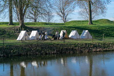
Fairly obvious

My first example is in my opinion an obvious choice.
A photo made at a re-enactment at Slot Loevestein in the Netherlands. Some tents, soldiers, water, grass, trees and sky. The tents make a nice horizontal line, they have a nice reflection, which also is horizontal. In fact, I would say all lines in this photo are horizontal. You could exclude the trees, but it's not the trees that are the subject. The line of trees add to the scene as environment.
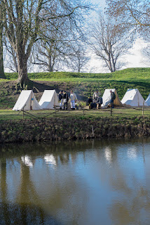
Here we have almost that exact line of tents, soldiers and trees. Due to the width, the tent on the right mostly fell off, you just see a small part of it. If I would have wanted to bring over the idea there would be many more tents there, this might have been a possibility.. The water, instead of a horizontal feature, now feels more like a square area and is hogging the lower part of the photo. Unfortunately with little detail, except for a shadow of something unrecognizable on the lower left. There is also more air. Which is not too bad as a background, but not a very interesting air to have much of. The leafless trees of which we can now see more and higher branches also do not add much to the photo.
The subject of the photo here was the horizontal line of tents and soldiers, plus the also horizontal reflection of it in the water. The air and water at the top and bottom add nothing to this photo. So I think this indeed is a fairly obvious example of that generic rule: horizontal subjects are best displayed in a horizontal orientation.
Of course, a photographer does not call this horizontal or vertical, he calls it landscape or portrait mode. For the diagonal orientation is no photography term yet, so, giving it is bold and dynamic I opt to call that boldamic mode. Keep in mind where you heard that phrase first, I want due credit for it!

Less obvious

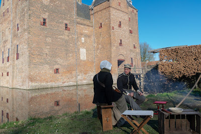
My second example is already less obvious, because it might depend on what I would want to bring over. Both photos have a couple sitting in front of a castle.
At that same re-enactment as the previous photos, I saw these two people sitting and talking. They looked nice enough to make a photo of them, with enough of the castle in the background to give a clue about the surroundings. I would call this a decent photo and am happy with it. To me the composition is nice enough and it brings over what I wanted to show people.
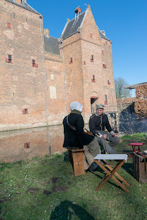
What the previous photo had less, was showing the height of the castle. Okay, not really fair, you can see the roof starting, so you get an obvious hint. But the left side could be awesomely high. So I added the photo in portrait mode. For showing the height of that left part, portrait mode is more suitable. There are some annoying things on this photo, which makes it not my choice. Mostly: to not have the people tucked away in the lower corner, I had mroe grass on the foreground. It unfortunately adds nothing, but - like the previous one with the water - an undistinguished shadow. The castle seems to lean more backwards here, and I miss out on that table in front of them, which I think makes a decent foreground, contrary to the grass.
So, I would again pick the landscape photo, because I think it is way more pleasing and better balanced. Plus it shows the people in front of the castle, with just enough information about the size of the castle. The portrait photo gives more information about the height of the castle, but less about the width, as you now do not see the corner. Therefore I would say it's still fairly obvious which is the better photo, but it does demonstrate that the orientation might convey different things.

I changed my mind

The next example had me change my mind about the orientation I would choose. Again two photos taken at that same re-enactment.
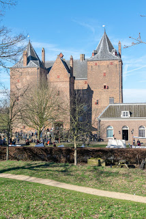
 At one side was a low hill, from where you had this view of the castle. It offered a nice possibility of showing the castle, including a few of the buildings next to it. I would not call this the greatest shot ever. The leafless trees do frame the castle, but somehow leafless trees rarely make lovely frames. There are also a leafless trees in front of the castle. Nonetheless, there is most likely not much better to get from this angle and it does give a bit of an overview.
When I arrived at that low hill, I actually wanted to have a photo of the castle and not much of the other buildings. I also wanted to show the castle has a bit of height. So, portrait mode was obviously needed. I did notice the branches on the right poking into the photo, but could not easily find an angle without them, so decided I would later remove them in post processing. This photo obviously emphasize the height much more than the portrait photo does. So you could call this: mission accomplished. Of course, as I looked at both photos later, I felt the landscape mode did bring over way more than the portrait one. Which made me happy that I had taken a shot in both portrait and landscape mode.

Which is better?

If you got this far, you probably already know I am going to answer this with: neither. It all depends on what you want to bring over. But from my last example, you might get the idea that I do advise making a shot in both orientations. Even if you think you need only portrait, as I did with my last example, it can be worth making the other one. It can surprise you later.
I often take both, if I have the time for it. As I am usually just snapshotting, I do sometimes get photos where my original idea of portrait or landscape simply does not work out as good as I thought. And hey, it's a digital camera, the extra shot is only a click away and costs nothing if you decide not to keep it.

Now just one final remark about this part of composition. In all my examples I preferred the landscape orientation, so you might think I do never pick portrait. The photo I actually published from the first examples was a portrait one. Is it better? I do not know, but it is the one I finally picked. Although it is obvious that I changed my viewpoint a little, because it was not possible to make that photo from the position the other two were taken from. And that shows the number one of Rick's rules on my previous blog entry about composition: value viewpoint.
Besides the last one, none of the photos was edited, besides a bit of exposure compensation. White balance is not set, nor any other edits.